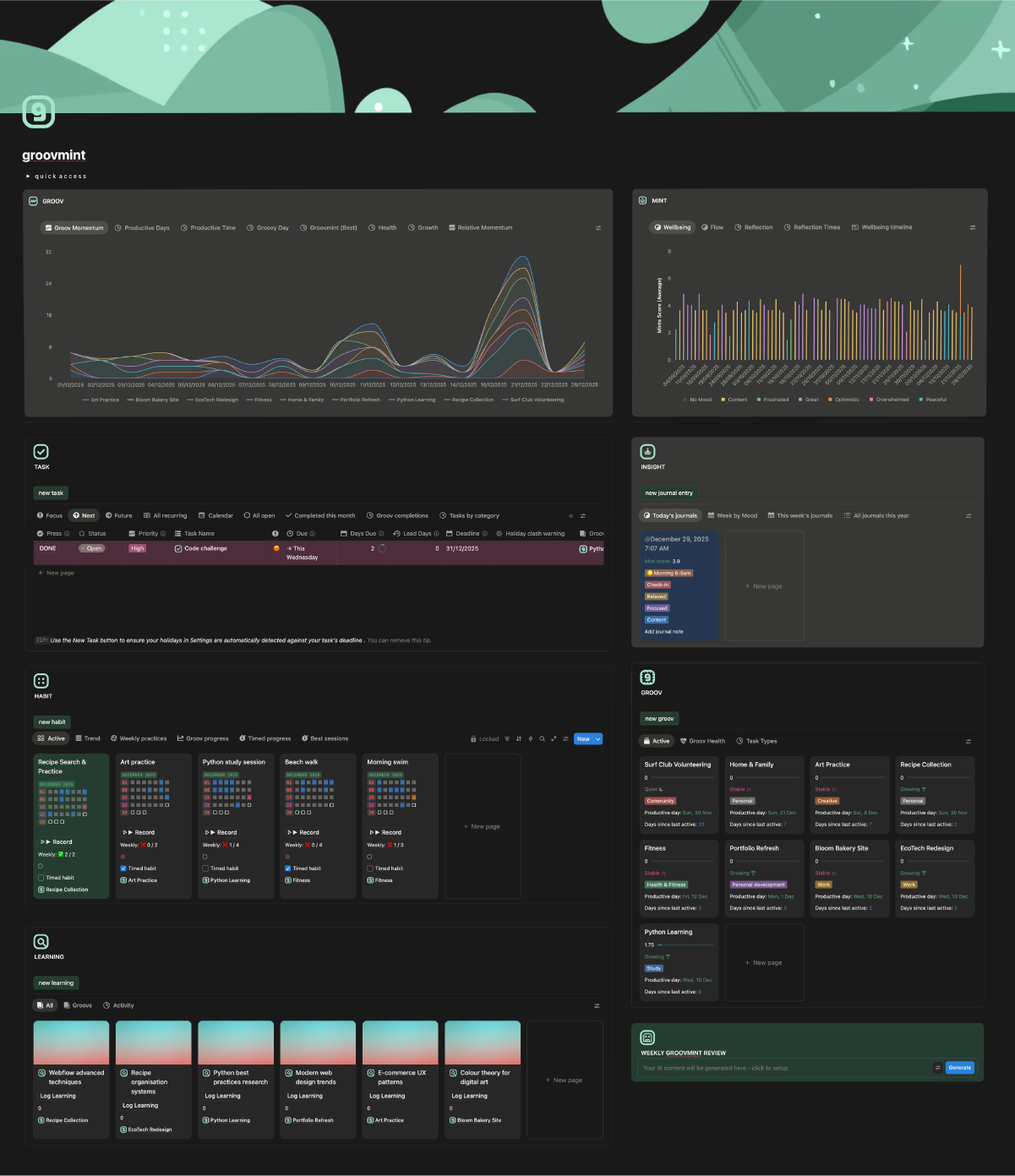
dashboard view
Your dashboard is your home base in groovmint. Everything you need to see, do, and track is laid out on a single page - your momentum, your tasks, your habits, your learnings, and your wellbeing, all at a glance.
Take a moment now to compare the sample dashboard image below with your own new groovmint dashboard in Notion. Your dashboard will look the same but without any data yet - the components are all there, just waiting for you to fill them over time.
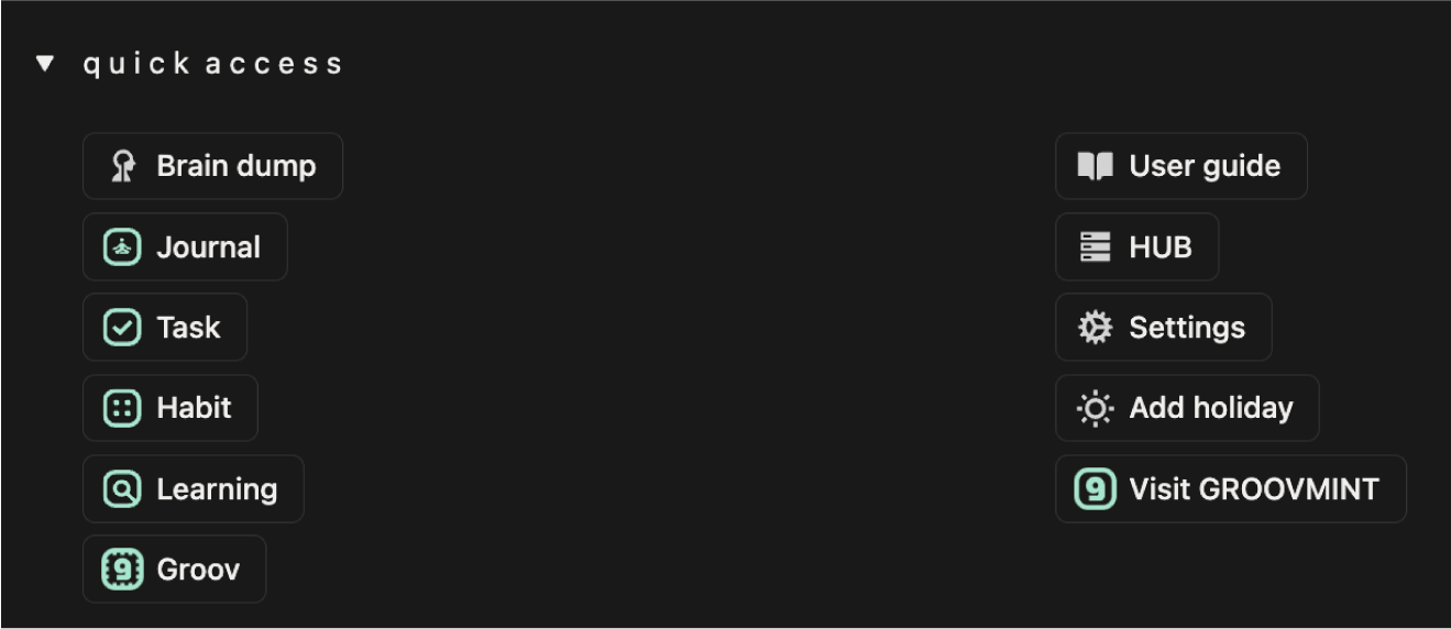
Quick access
At the top of your dashboard you'll find the Quick Access menu - a dropdown that gives you fast access to the most commonly used actions and pages in groovmint. From here you can create new entries for any component, open the HUB, jump to Settings, add a holiday, or come back to this User Guide at any time.
Dashboard and hub
Your dashboard page is what you work from every day - it shows you everything you need at a glance.
But all of your actual data lives in a separate page called the groovmint/HUB.
The dashboard pulls linked views from the HUB, which keeps the dashboard fast and lets you create multiple dashboard layouts without ever breaking your data. You'll rarely need to visit the HUB directly, but it's important to know it's there. We cover it in detail in The Hub section of this guide.
Visualisations
At the top of your dashboard sit two visuals - GROOV and MINT. These are your analytics views, giving you a rich, visual picture of your momentum and wellbeing data from multiple angles. Each panel has a set of views you can switch between depending on what you want to understand.

Groov visuals
At the top of your dashboard sit two visuals - GROOV and MINT. These are your analytics views, giving you a rich, visual picture of your momentum and wellbeing data from multiple angles. Each panel has a set of views you can switch between depending on what you want to understand.
Note for Free Notion users
Only the Groov Momentum chart is available on free accounts. The remaining views are available as table and list views instead.
Paid Notion user chart views
Groov Momentum
A line chart showing your daily Groov Momentum Score per Groov over time. This is not a cumulative score - it shows each active day's score only, and intentionally excludes days with no activity. When you're active, how well are you doing? That's what this answers.
Groovy Day
A gauge showing your single best ever day for total Groov Momentum, with the date it occurred and the total score. A personal milestone to aim for and beat.
Productive Days
A horizontal bar chart showing your median Momentum Score broken down by time of day, per Groov. Helps you understand not just when you're most active, but when your activity is most productive.
Groovmint (Best)
A donut chart showing your best ever day's total score split between your Groov momentum (blue) and your Mint wellbeing score (amber) on that same day. A snapshot of your peak performance and how your wellbeing aligned with it.
Health
A horizontal bar chart showing all your Groovs grouped and colour-coded by their current health status. At a glance you can see which Groovs are Growing, which are Stable, and which need some attention.
Growth
A cumulative line chart showing your total Momentum Score building up over time per Groov, grouped by week. Unlike Groov Momentum, this one is cumulative - it shows the full story of how far you've come.
Relative Momentum
A line and area chart showing recent momentum trends per Groov. Like Groov Momentum, this is not cumulative and excludes zero days, but it focuses on recent periods to show you how your momentum is shifting right now.


Mint visuals
The MINT charts visualises your Insights Journal data - your wellbeing, mood, energy, and how they flow and change over time.
Note for Free Notion users
Free users have access to the Wellbeing timeline (calendar view), the Flow table (journal entries sorted by Mint score showing mood, feeling and energy), the Wellbeing list (journal entries grouped by month with Mint scores), and the Reflection Times table grouped by time of day.
Paid Notion user chart views
Wellbeing
A bar chart showing your average Mint score per journal entry, colour-coded by mood. Excludes zero values. Gives you a quick picture of which moods tend to produce higher or lower wellbeing scores.
Flow
A smooth area and line chart showing your median Mint score over time, broken down by mood. Excludes zero values. Shows you how your different emotional states have flowed and shifted across your journalling history.
Reflection
A line chart showing your average Mint score per day over time. Excludes zero values. The big-picture trend line of your overall wellbeing journey.
Reflection Times
A line chart showing your all-time median Mint score for each time of day (Morning, Mid-morning, Afternoon, Lunch, Late evening). Helps you discover when you naturally feel your best.
Wellbeing Timeline
A calendar/timeline view showing your journal entries plotted by date, colour-coded by mood with the Mint score shown. Lets you spot patterns at a glance across weeks and months.
The six components
Below the Visuals, your dashboard is made up of six components. Each one is a working section of groovmint where you log, track, and manage your activities.
Groov
Your Groov cards and list views, showing momentum, health, productive day, and days since active for each of your active Groovs. This is where you create new Groovs and get the at-a-glance picture of how each area of your life is tracking. See the Groovs section of this guide for full details.
Task

Your full task list with smart views that automatically sort your tasks into Focus, Next, and Future so you always know what to work on first. See the Tasks section of this guide for a full breakdown of the task views and how alerting and recurring tasks works.
Insight

Your Insights journal entries, with views by mood, reflection, and timeline. See the Insights Journal section of this guide for full details
Habit

Your habit tracker, showing your active habits with their heat map grids and logging buttons. See the Habits section of this guide for full details.
Learning

Your learning and research pages, displayed as cards grouped by Groov. See the Learnings section of this guide for full details.
Review

An AI-powered weekly summary that pulls together your activity and generates a personalised review of your week. (Note that you need a Business or Enterprise Notion subscription to use this feature. If you don't, feel free to remove from the dashboard)